Not every burger brand needs to be precious about it.
The smash-burger category exploded, and the brand look followed it into polite territory — neutral palettes, soft light, craft typography, laminated menus. BUNZ didn't want to join that room. It wanted to cut through it. The brief was for an identity that felt loud and unapologetic — a shop that serves burgers fast, hot, and honest, and looks the part.
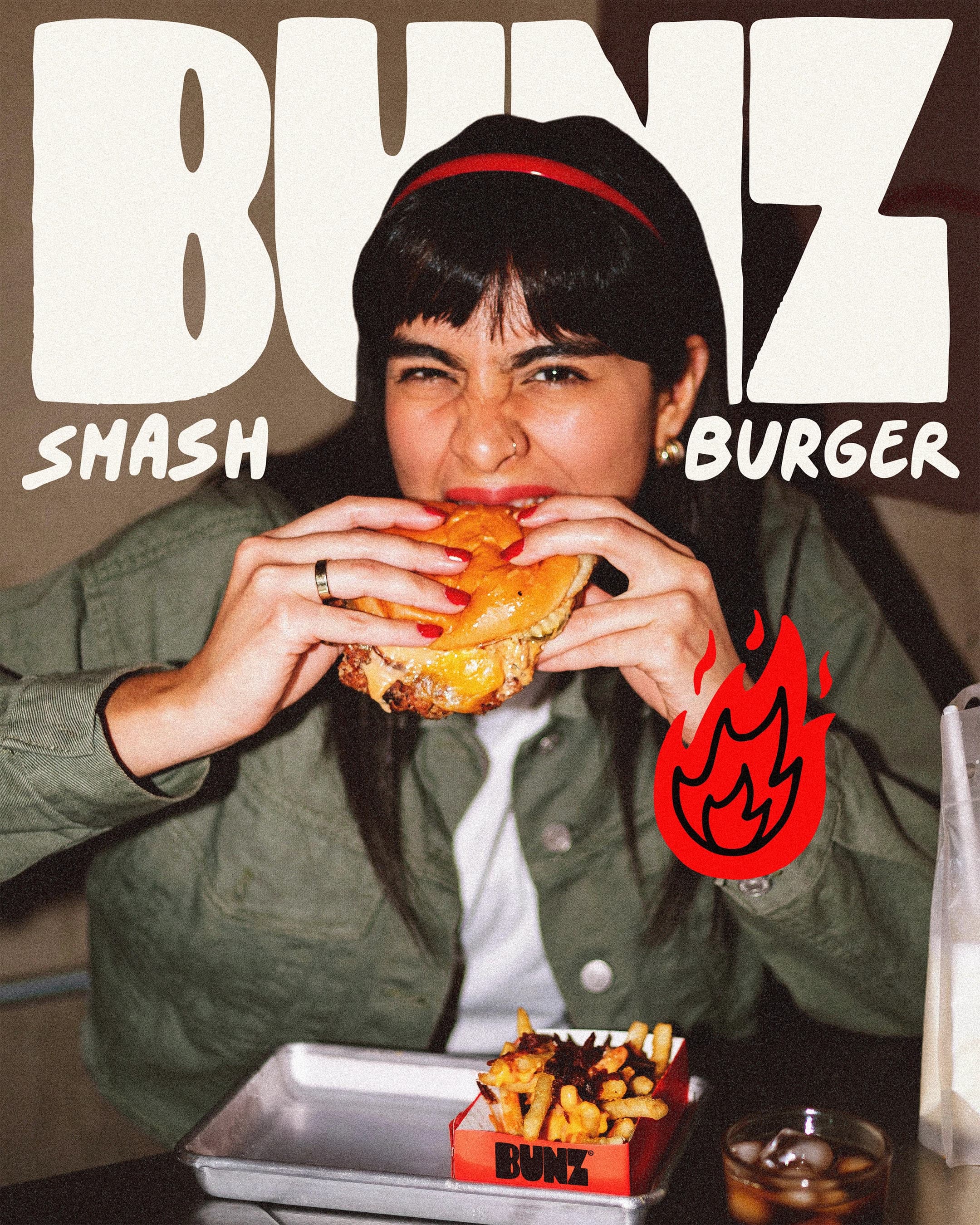
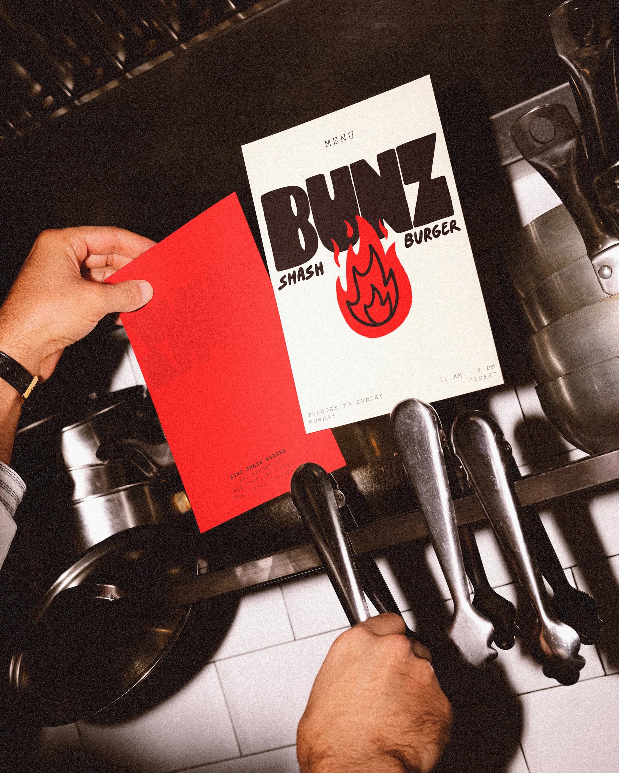
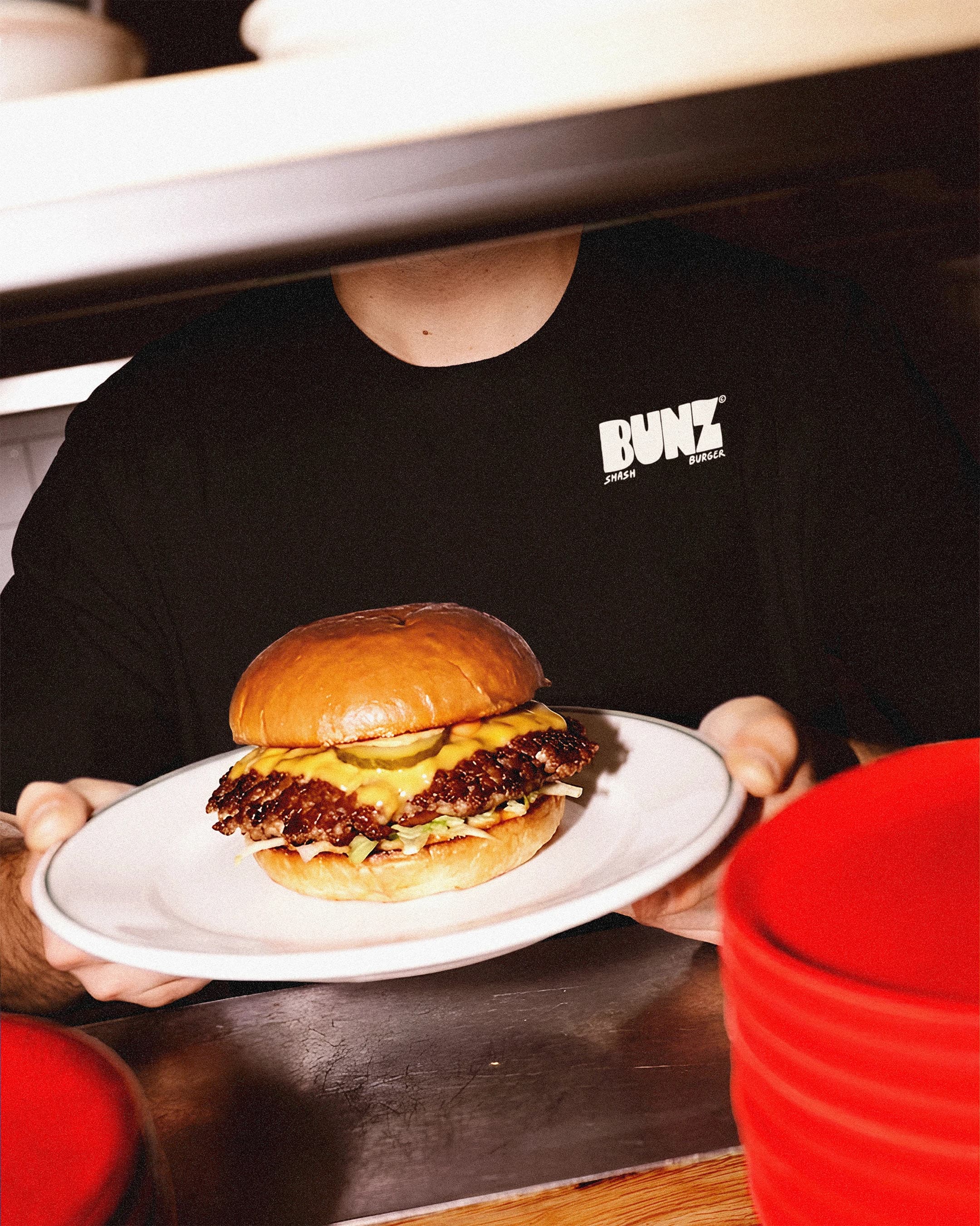
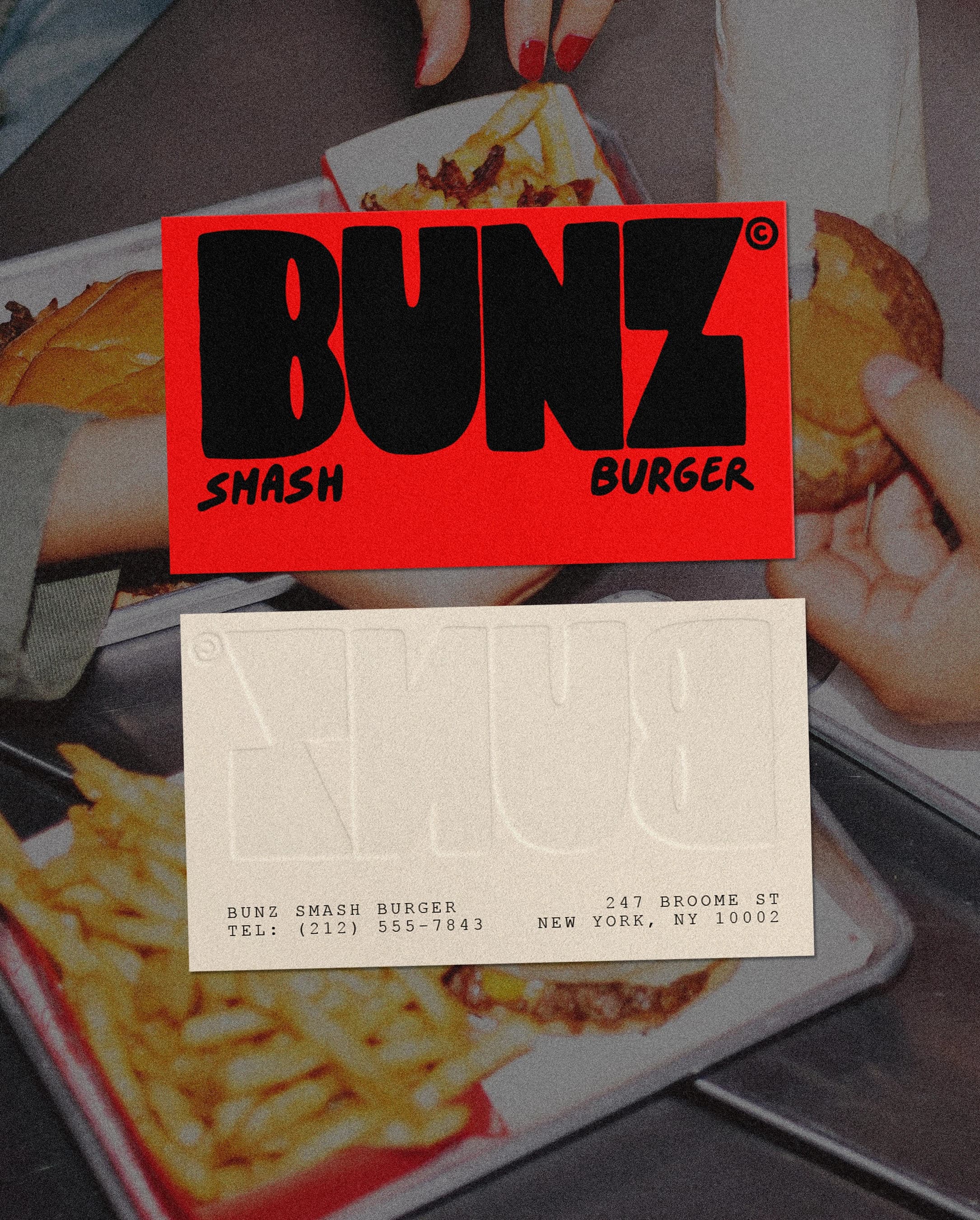
The system leads with a distressed hand-drawn wordmark and a flame mark, a red-on-black palette with cream for contrast, and raw service-counter photography that shows hands, grills, and plates crossing the line — not hero food styling. Menus behave like posters. Packaging (fry boxes, ketchup packs, red takeout bag) reads like merch. Business cards are red front, debossed cream back. Every touchpoint is tuned to feel like it came out of the kitchen, not a design studio.
Wordmark Reveal
01 / 09

Hero Campaign
02 / 09
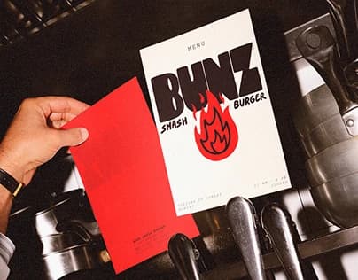
Menu Flyer
03 / 09
Service Counter
04 / 09
Staff Tee
05 / 09
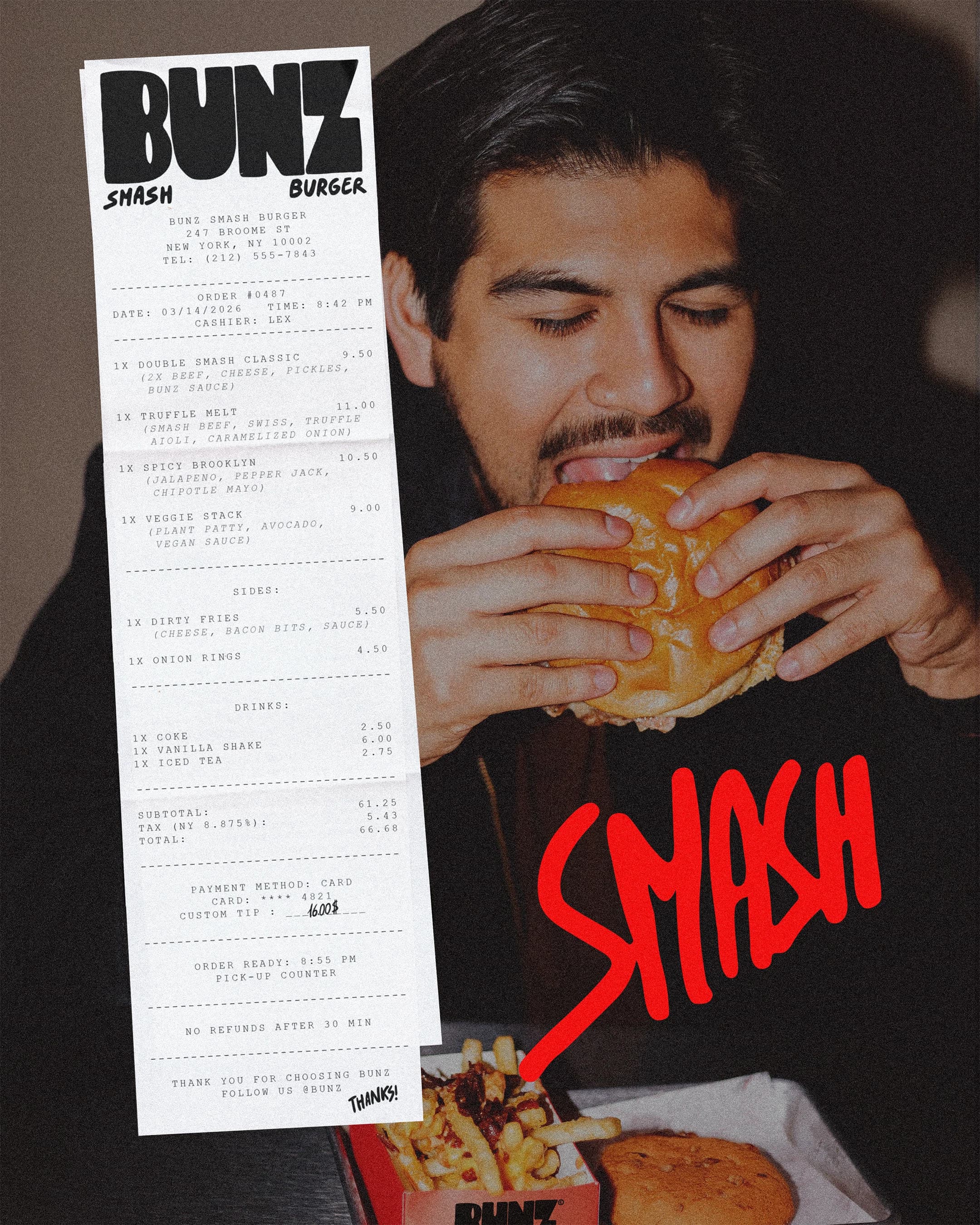
Receipt & Smash
06 / 09
Takeout Bag
07 / 09

Fries & Condiment
08 / 09

Business Cards
09 / 09
Next
